
After completing a number of design jobs for Actevate, they asked us to help with a new venture. The creation of a new business logo.
Connection is key
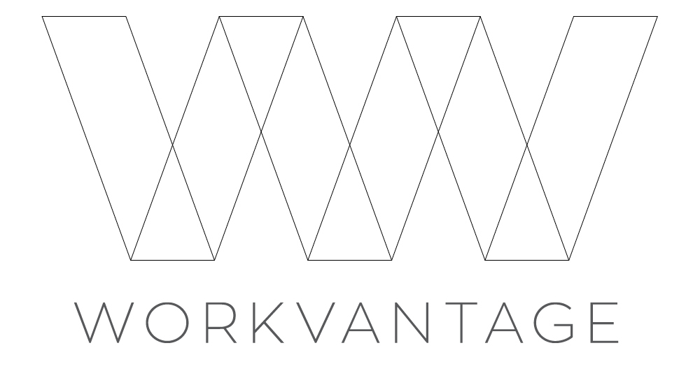
Our brief was to create a simple, stylish new business logo design that would represent connection and flow.
Our demographic was professional business people aged 25-45.
We wanted a logo that stood out from the competitors’. This proved tricky because of the conservative style and colour.
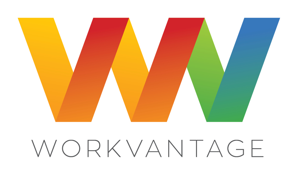
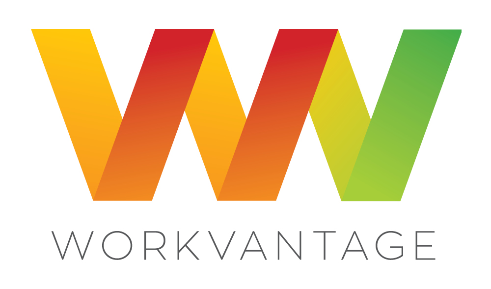
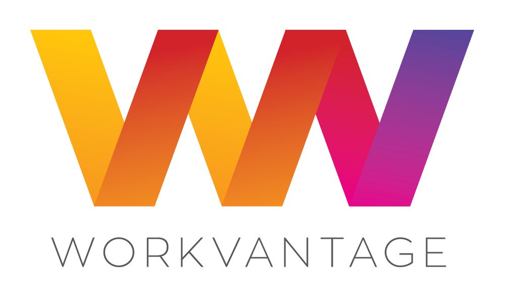
One of the most important aspects of logo design is ensuring it can be extended across all elements. The band roll out uses these elements to show consistency throughout the collateral. The strong angles and bold colours ensure this would happen.
The logo is based on the Zona Pro font because we felt the angles and shapes worked well. The angles in the logomark line up with the actual font. The elegance of the light logotype balances the heavier, yet brighter logomark.
Lastly, the new brand had to tie in with the Actevate brand. With this in mind, we chose colours that would sit comfortably, and straight lines and angles that worked well with the Actevate circles.