
Kollectiv was contacted by a new client to produce a mobile app icon design. We had done various app and phone designs in the past. These included skinning event apps for companies such as Optus. This artwork was mainly used during conferences by the attendees. In this case, the Juxta app icon was to be used for a new product launch.
The brief
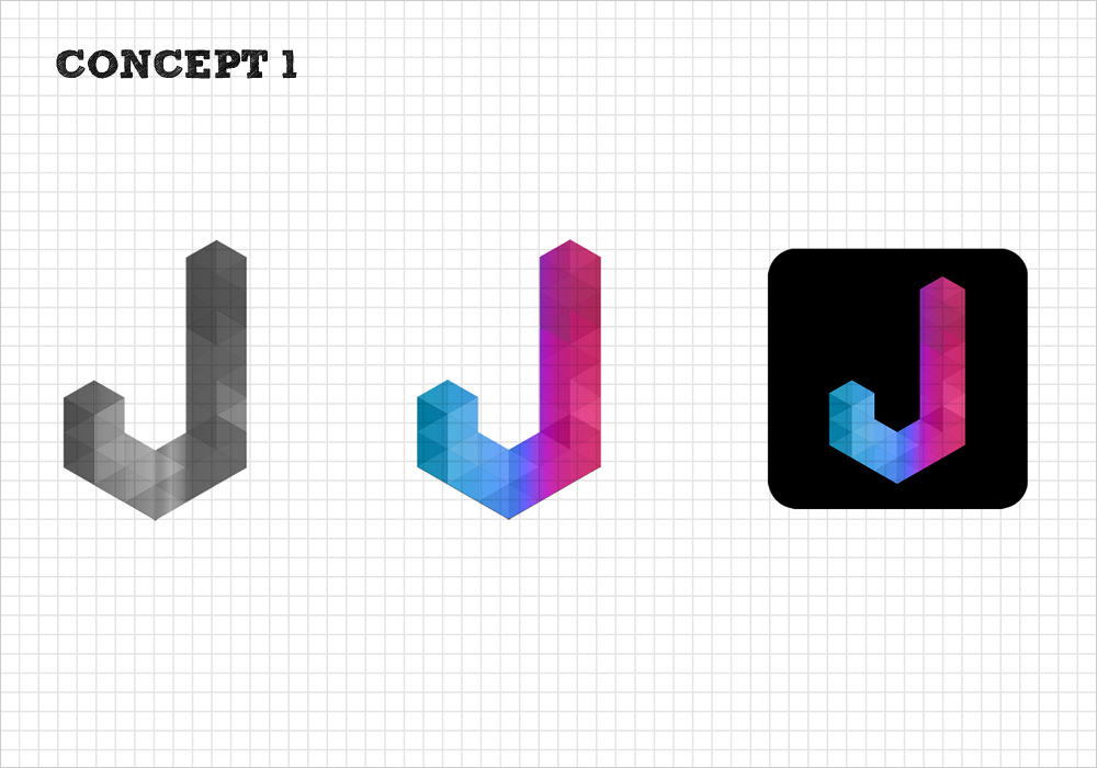
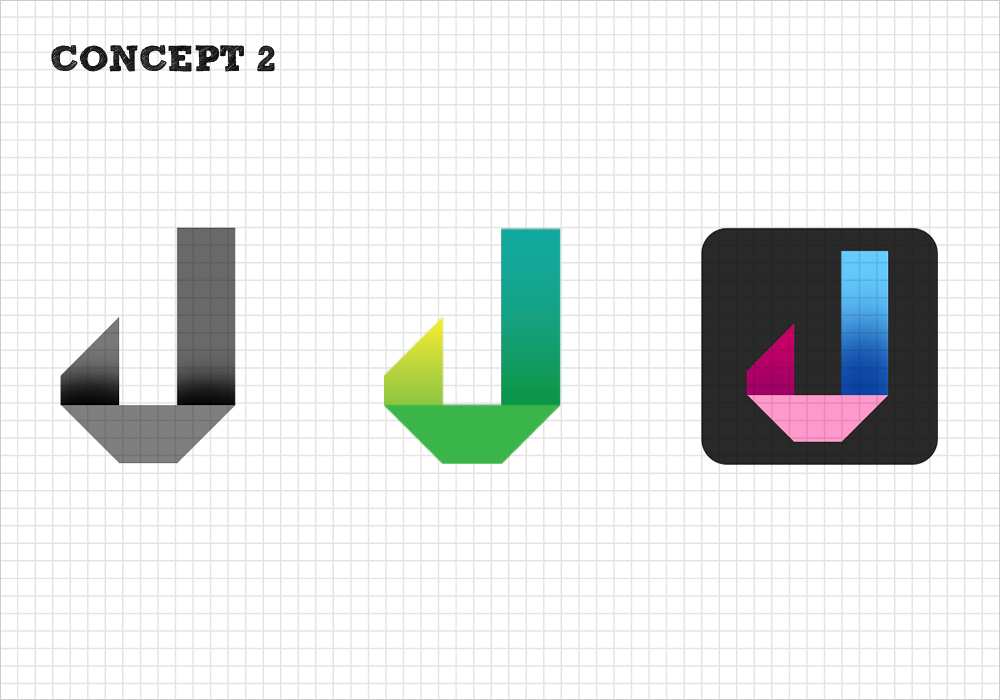
The Juxta app would allow you to create a juxtaposition of images. The app icon design had to represent the overlap and flow of images. With this in mind, I created three quite different concepts. The client mixed and matched and narrowed it down to one option. With this concept, we created three different colour schemes.
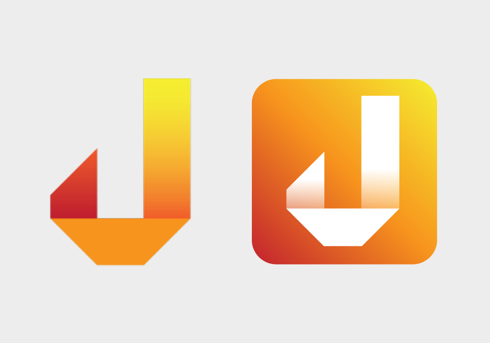
The final product
The final mobile app icon design was supplied in full colour, black and white as well as inverse. It came with brand guidelines which included the usual colour breakdowns and fonts. Additionally, it included a variety of different shaped elements and angles that could be used for marketing. It was an interesting exercise in that creating such a small design, needed to roll over into a whole brand look and feel.
Kollectiv is often asked to create wordmarks, please click here to see another example of this kind of work.