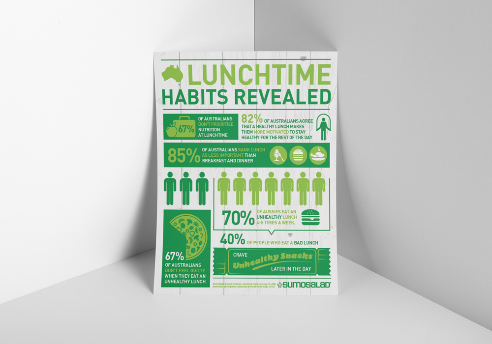
SumoSalad is a salad franchise that began in Sydney in 2003. They are known for adapting to the market to stay ahead of the game. Kollectiv had been creating Sumosalad’s social media posts, EDMs and in-store signage for around two years. As a result, they contacted Kollectiv to ask for us to create a research and infographic design.
Infographic brief
SumoSalad had conducted research into Australia’s lunch-time eating habits. It focussed on the benefits of eating a healthy lunch. It also researched feelings around eating unhealthy food during the day. This research needed to be laid out in an easy-to-consume manner. It would be printed on a flyer and left at restaurants. Additionally, it would be used digitally on their social media ad websites.
The outcome
The Sumosalad brand was clean yet rustic. With this in mind, it quite often used white planks as backgrounds. The brand colour was a grass green. For this research and infographic design we matched it with a lime green. We used SumoSalad fonts, but mixed them with some more fun fonts to brighten it up. Finally, we created a range of icons to back up our statistics and tell the story visually.
Kollectiv often gets asked to create research and infographic design for businesses as well as educational facilities. Click here to see an example we did for SBS.

