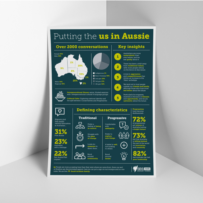
The Kollectiv team had been creating various digital, print, presentation and infographic graphic design for SBS for a few years. SBS had pulled together a survey called “Putting the us in Aussies”. SBS asked Kollectiv to pull together a flyer with a twist of an infographic feel to bring the statistics to life.
The research
SBS had interviewed a diverse range of 2000 Australians. Half male half female. It asked questions relating to culture, optimism and immigration. Additionally, it compared different viewpoints such as traditional and progressive.
The point of the flyer was to do a quick overview of the research to present to clients. Importantly, this was to show them a snapshot of what Australians were feeling. Consequently, it would help them understand their potential customers.
Pulling it together
Being given the SBS brand guidelines, we had to use the SBS fonts, colours and icons. Using white on the navy blue kept the information contained. With this in mind, the lime green highlight helped pull out the key statistics and information. Importantly, infographic graphic design needs to make the information and statistics flow seamlessly. It also needs to lead onto the next section of information. This flyer was used in printed form, as well as digitally, to show that SBS listens and understands its audience.
Kollectiv Studio creates a range of infographic graphic design for showcasing research. Click here to see more infographic work.

