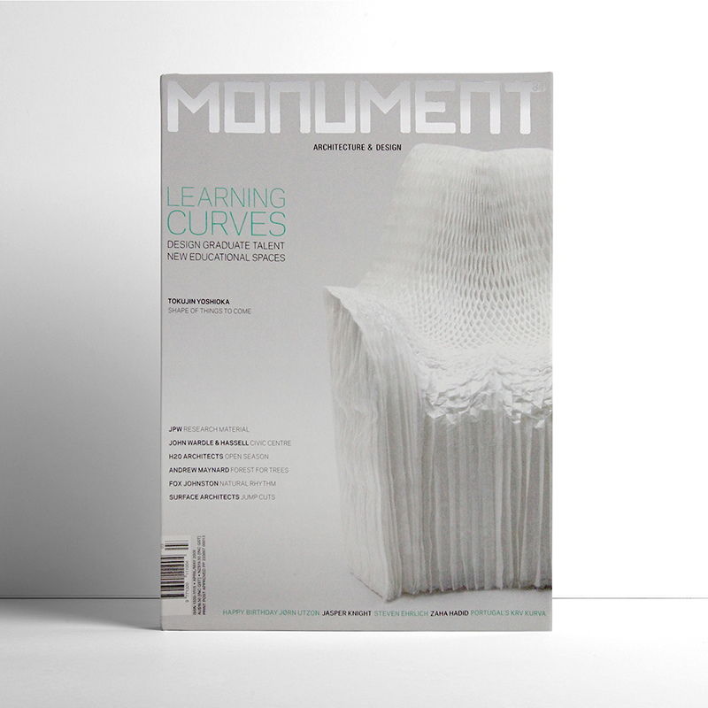
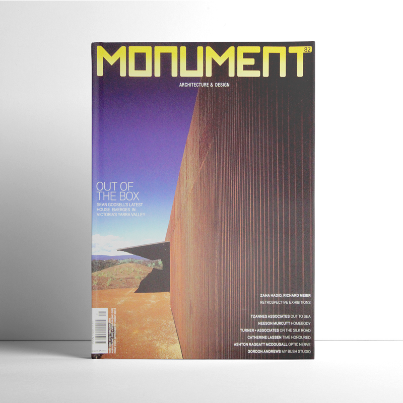
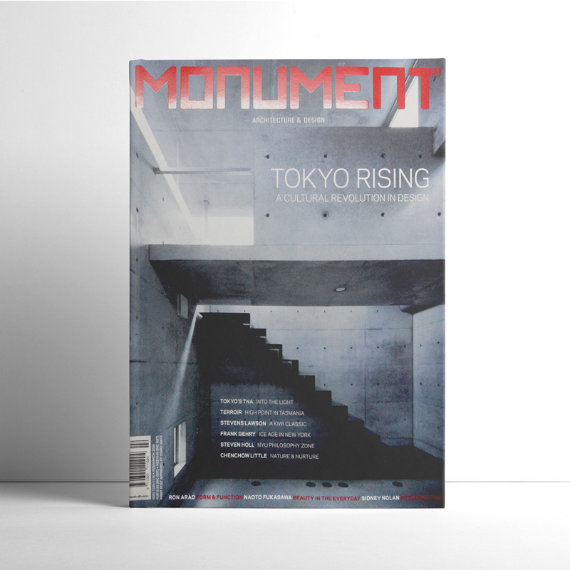
With much of our earlier work being in publishing, one magazine cover concept and design really stood out above the rest. Pacific+ had recently acquired Monument magazine. I came on board to as the Creative Director of Monument as well as all other titles. Part of the role was to do the magazine cover concept and design of around 15 magazines. I also redesigned titles, pitched for new work and oversaw the design teams. The magazines included Virgin Australia magazine, Weight Watchers and Lexus magazine. The biggest win for Pacific+ during my time was my much anticipated winning pitch to re-sign the Weight Watchers magazine contract.
The Monument reader
The most exciting thing about Monument was that it had loyal readers. It didn’t need huge, eye-catching slogans to sell it. The demographic was mainly architects and designers, so they appreciated simplicity and style within the magazine cover concept and design. The internal pages relied on stunning architectural photography and typography.
Monument had a very small print run compared to other titles we had worked on. It was also printed on a premium stock as it was often kept for reference. Therefore, the expense of using a foil or varnish for the masthead wasn’t a great cost and we used it on most issues.
Design for the building industry
Kollectiv has had over 15-years of experience within the home-building and architecture industries. Advertising and design clients have included Think Brick, Clarendon Homes and Eden Brae Homes. We have also been commissioned for work on magazine titles. These include House & Garden, Vogue Living (UK) and Living Etc (UK). From this experience, Kollectiv has gained a great network of stylists, photographers and writers.


