
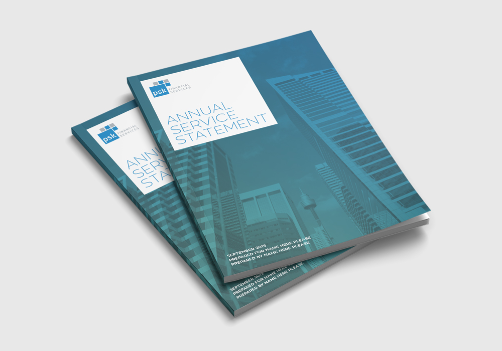
PSK Financial Services were looking for a creative design team to breathe life into their financial report designs. Often these contain tedious information and are notoriously hard to read.
To get them excited, we referred to work that we had previously done for Actevate. This proved that heavy and dry copy could be presented in a way to make it more interesting to the reader.
Info without the overload
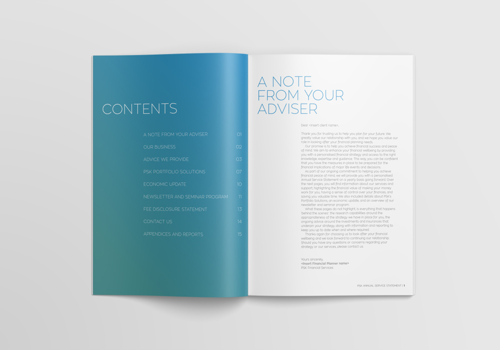
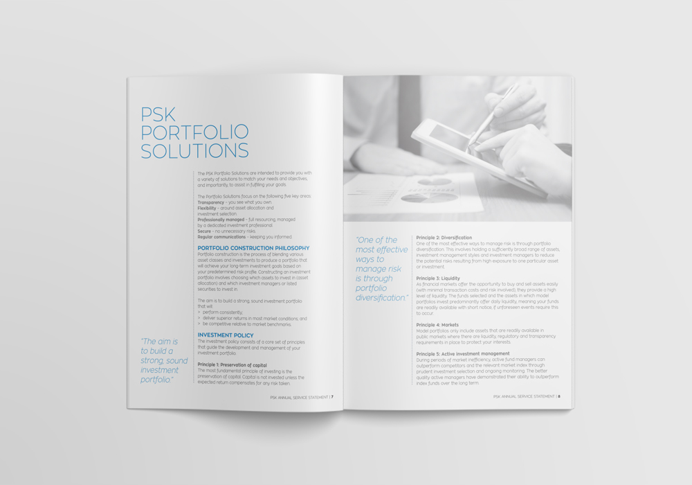
With so much info to digest, we had to create a way to make the financial report design palatable. Images could not be used just to fill up space. With this in mind, we came up with a design that broke up the information using blocks of colour and icons where necessary.
To visually supplement the PSK brand blue, we introduced a small range of secondary colours. These were then used throughout their documents to add visual interest. Additionally, they helped differentiate each document within a series. The PSK grey was also used for body copy and images.
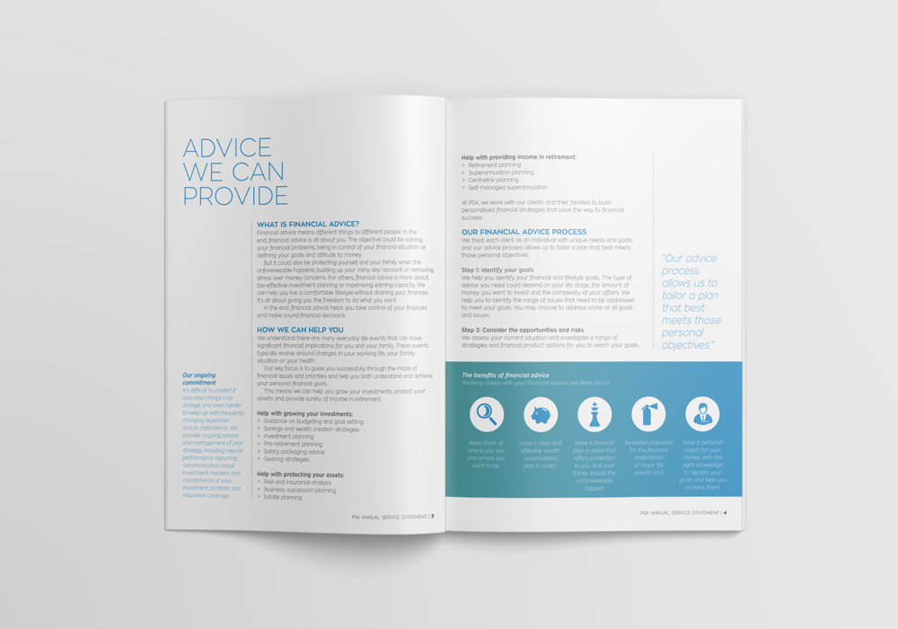
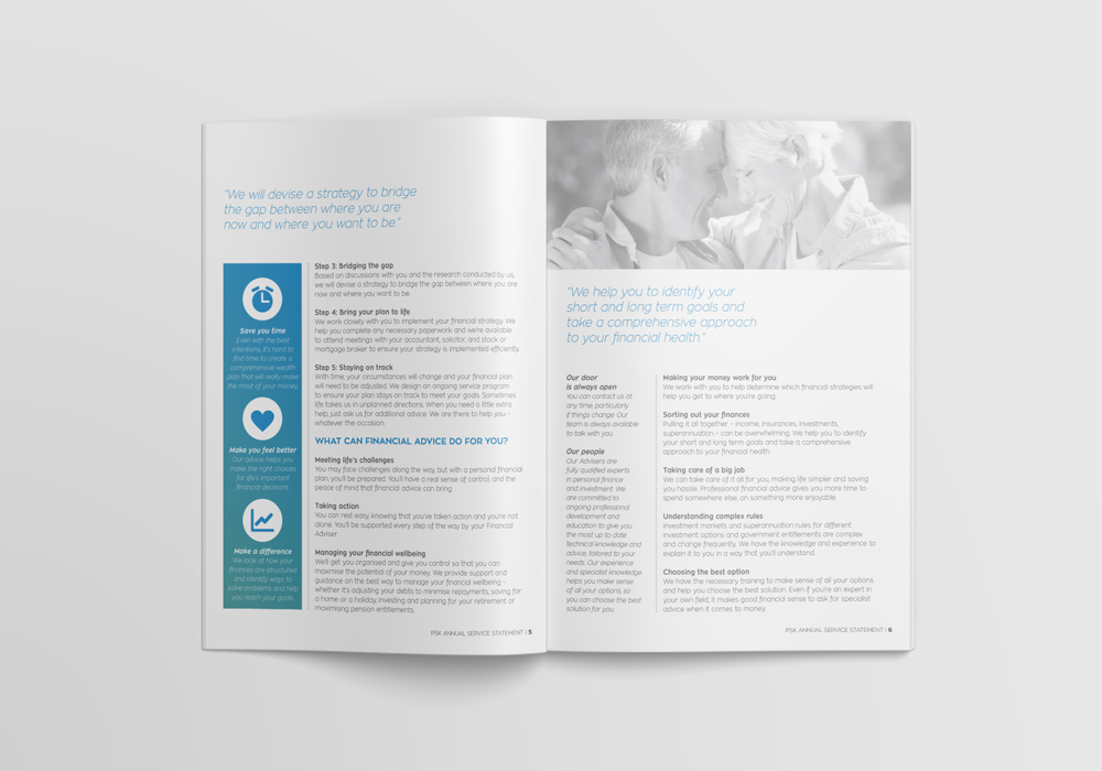
To further aid digestion, large chunks of copy were broken down to bite-sized box-outs or paragraphs. Icons were used to bring attention to important points, and negative surrounding space was used to bring out quotes.
With a play on brilliant whites and big, bold blocks colour, the PSK Service Statement certainly made a statement.