
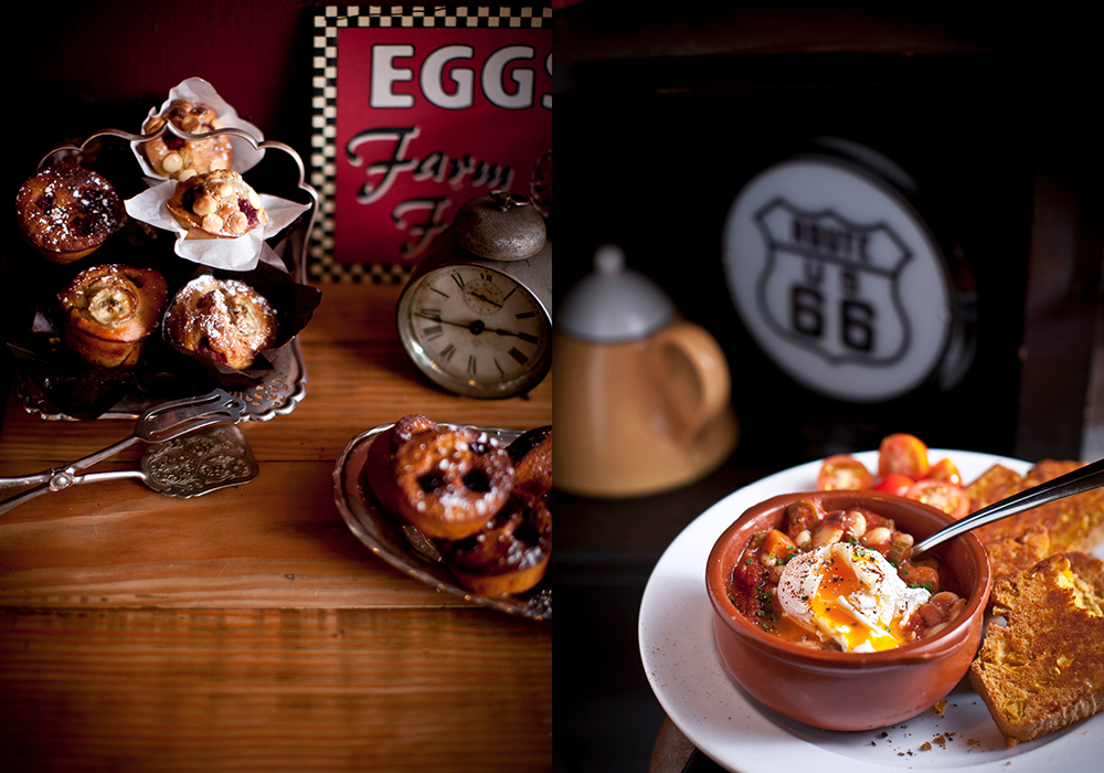


When Silverbean opened on Enmore Road, it quickly became the most popular cafe on the strip. Their menu was inspired by the deep South of the USA, with comfort food such as cornbread and beans. They had rockabilly music blaring and dressed like they were in a cowboy movie. They parked their vintage ute out the front, where it was like a free billboard that attracted crowds.
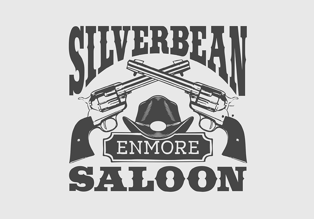
With great style and an even greater menu, it was easy to come up with a cafe logo and brand design that suited them.
Silverbean owner George had seen my work for Mercenary Marketeer and wanted something similar. The logo was to go on the shop as well as on his vintage truck.
The brief
The cafe logo and brand design brief was pretty simple. George wanted a saloon-style logo, with cowboy guns and western font. Additionally, it needed to be designed in a few different shapes to suit various mediums.
Creating the brand
I commissioned Katie Quinn-Davies to photograph the cafe for their marketing material. At the time, Katie had just become the world’s most adored food blogger. She had really made her mark in Sydney, notably photographing the grounds in Alexandria before it opened. This was the first time I had worked with Katie, and I was blown away by her independence and down-to-Earth attitude.
When brands grow too fast
By the time we had rolled out the new look and feel, Silverbean cafe had more customers than they could handle. So to limit the patronage, they didn’t end up spending any money on advertising.
Sadly, after working like dogs for a year, they ended up selling to a new owner just to have a break.
Unfortunately, in situations like these, the owners make the cafe. As soon as the original owners left, so did the character.