
A local architect was looking to go out on her own and needed an architecture logo and brand design. She was working for a larger Sydney architecture firm. However, she was always being asked if she could do smaller on-the-side jobs. We thought it would be a good idea for her to set up a small business. This would enable her to take on those jobs that were too small for the studio she worked for.
With this in mind, the architecture logo and brand design were more of a calling card than a studio. People were approaching her for her style. Therefore, the look and feel had to capture the essence of the person, rather than the business as a whole.
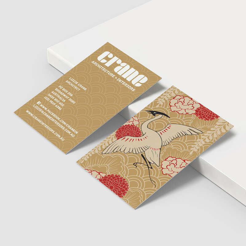
Developing the brand
The architect was greatly influenced by Japanese culture and dressed in that style. She also happened to have the last name ’Crane’. Because of this, I decided to mesh the two elements together to produce a stylish, yet traditional Japanese-style card. Red was one of her favourite colours. With this in mind, we used it as the accent colour in the illustration. The more traditional illustration style was balanced by a modern logotype on the front. The typeface used was also modern, clean and stylish, to take it away from the traditional element.
Kollectiv often creates logos and branding for small or new business. Click here to see more work Kolectiv has created in the Home & Living industry.